
In this essay, I will try to cover all you need to know about Flutter animations in great detail and with numerous examples. By the end of this article, you’ll be able to apply animations of varying complexity to your Flutter project. And you’ll know which of the numerous Flutter techniques is most suited to your animation needs. So let’s get started!
Introduction
Animations in a Flutter app can be classified into two types: drawing-based animations and code-based animations. Drawing-based animations are made up of animated images, vectors, characters, or anything else that is “drawn” and then animated. Code-based animations, on the other hand, are focused on widget layouts and styles (lists, colours, text, etc.). We’ll discuss drawing-based animations briefly at the end of this article, but because they’re normally accomplished with third-party frameworks/packages, we’ll concentrate on code-based animations. This is not to argue that code-based animations are limited; rather, Flutter animations allow you to create incredibly amazing, imaginative, and quite complicated animations without the use of third-party packages!
Flutter code-based animations are classified into two types: implicit animations and explicit animations. In
Implicit Animations
These are the simplest and most straightforward animations. Changing a value causes an animation to play, and Flutter handles everything behind the scenes.
1 Implicit Animations with Ready-to-use widgets
They’re known as AnimatedFoo widgets, with Foo being the animated property. The majority of them are animated versions of widgets you’re already familiar with and use, such as Container/AnimatedContainer, Padding/AnimatedPadding, Positioned/AnimatedPositioned, and so on.
Only the AnimatedContainer, AnimatedPositioned, and AnimatedDefaultTextStyle widgets were used to create this animation. Simply provide them with a duration value and a changing variable, and you’re ready to go!
AnimatedPositioned(
  top: selectedItemIndex * itemHeight,
  left: 0,
  right: 0,
  duration: const Duration(milliseconds: 200),
  curve: Curves.easeInOut,
  child: //...
),
//...
AnimatedContainer(
  duration: const Duration(milliseconds: 200),
  curve: Curves.easeInOut,
  decoration: BoxDecoration(
    color: selectedItemIndex == i ? yellow : pink,
    border: Border.all(
      color: selectedItemIndex == i
          ? Colors.white
          : Colors.transparent,
      width: 2,
    ),
  ),
  child: AnimatedDefaultTextStyle(
    duration: const Duration(milliseconds: 200),
    style: TextStyle(
      color: selectedItemIndex == i
          ? Colors.black
          : Colors.white,
    ),
    child: const Text('Featured!'),
  ),
),And simply each list item is wrapped with an InkWell widget with the following onTap method:
onTap: () => setState(() => selectedItemIndex = i),Here’s a full list of available AnimatedFoo widgets
- AnimatedAlign
- AnimatedContainer
- AnimatedDefaultTextStyle
- AnimatedOpacity
- AnimatedPadding
- AnimatedPhysicalModel
- AnimatedPositioned
- AnimatedPositionDirectional
- AnimatedSize
For attributes like opacity, padding, align, position, and so on, we have AnimatedFoo widgets. However, what if you still want something simple and quick to use but want to animate another property?
2. Implicit Animations with TweenAnimationBuilder
By employing a Tween class, the TweenAnimationBuilder enables you to indirectly animate any property of any widget. “Between” is the name of the Tween class. You may essentially animate between begin and end values that it provides. Additionally, you may apply the animated value from the TweenAnimationBuilder widget builder to whatever property you choose in the widgets you return to that builder.
And here’s the code:
TweenAnimationBuilder(
  duration: const Duration(milliseconds: 200),
  tween: Tween<double>(begin: 0.01, end: _sliderValue),
  child: Container(
    decoration: BoxDecoration(
      //...
    ),
    child: Slider(
      value: _sliderValue,
      min: 0.01,
      onChanged: (value) {
        setState(() => _sliderValue = value);
      },
    ),
  ),
  builder: (BuildContext context, double? value, Widget? child) {
    return ClipRect(
      child: BackdropFilter(
        filter: ImageFilter.blur(
          sigmaX: 40 * (value ?? 0.01),
          sigmaY: 40 * (value ?? 0.01),
        ),
        child: child,
      ),
    );
  },
);From 0.01 to 1, the _sliderValue variable is changed. Therefore, whenever a value is changed, an animation is started and the TweenAnimationBuilder widget’s builder is redone using the updated values for the BackdropFilter widget’s sigmaX and sigmaY properties. (I’ve set the minimum value to 0.01 because the BackdropFilter widget on the web displays an error when it receives a value of 0).
For greater speed, we are using the TweenAnimationBuilder widget builder’s child parameter here. This child rebuilds only once rather than each time the animation is triggered.
Explicit Animations
Do you recall a time when you could start an animation in implicit animations just by setting a variable within an AnimatedFoo or TweenAnimationBuilder widget? Explicit animations, however, don’t start to move until they are “explicitly” instructed to. And you instruct them on how to use an AnimationController to “control” and animate their animation.
Like implicit animations, explicit animations include ready-to-use widgets and additional customizable widgets that let you really let your creative juices flow!
What the devil is an AnimationController, though? Before we go into explicit animation widgets that use it, let’s take some time to understand about it.
The AnimationController
AnimationController({
  double? value,
  this.duration,
  this.reverseDuration,
  this.debugLabel,
  this.lowerBound = 0.0,
  this.upperBound = 1.0,
  this.animationBehavior = AnimationBehavior.normal,
  required TickerProvider vsync,
})You can “control” the animation with the AnimationController, as was previously explained. It requires a vsync value of type TickerProvider in order to do it. In essence, a ticker tracks the rendering of Flutter frames and enables the controller to follow and “animate” along the ticker for the designated amount of time. The ticker produces values linearly between the lowerBound and upperBound values, which are by default 0 and 1.
Thus, you can do the following using the AnimationController:
- call
forward()to play the animation forward - call
reverse()to play the animation in reverse - call
stop()to stop the animation - call
repeat()to repeat the animation as long as it’s visible - call
reset()to reset the animation to lowerBound - set it’s
value - Access various getters to know the state of the animation like:
isAnimating,isCompleted,isDismissed, …etc.
Explicit Animations with Ready-to-Use Widgets
These are known as FooTransition widgets, where Foo is the widget’s animated property. A few of them, like AlignTransition and PositionedTransition, are also animateable versions of the standard widget you use.
This was achieved with AlignTransition and RotationTransition widgets like so:
class ExplicitAnimations extends StatefulWidget {
  const ExplicitAnimations({Key? key}) : super(key: key);

  @override
  State<ExplicitAnimations> createState() => _ExplicitAnimationsState();
}

class _ExplicitAnimationsState extends State<ExplicitAnimations>
    with SingleTickerProviderStateMixin {
  late AnimationController _controller;
  late final Animation<AlignmentGeometry> _alignAnimation;
  late final Animation<double> _rotationAnimation;

  @override
  void initState() {
    super.initState();
    _controller = AnimationController(
      duration: const Duration(milliseconds: 800),
      vsync: this,
    )..repeat(reverse: true);

    _alignAnimation = Tween<AlignmentGeometry>(
      begin: Alignment.centerLeft,
      end: Alignment.centerRight,
    ).animate(
      CurvedAnimation(
        parent: _controller,
        curve: Curves.easeInOutCubic,
      ),
    );

    _rotationAnimation = Tween<double>(begin: 0, end: 2).animate(
      CurvedAnimation(
        parent: _controller,
        curve: Curves.easeInOutCubic,
      ),
    );
  }

  @override
  void dispose() {
    _controller.dispose();
    super.dispose();
  }

  @override
  Widget build(BuildContext context) {
    return BlurContainer(
      containerHeight: 200,
      child: AlignTransition(
        alignment: _alignAnimation,
        child: RotationTransition(
          turns: _rotationAnimation,
          child: const Rectangle(
            color1: pink,
            color2: pinkDark,
            width: 50,
            height: 50,
          ),
        ),
      ),
    );
  }
}Initialising and defining the AnimationController are done on lines 10 and 17.
This is taken from the SingleTickerProviderStateMixin (line 9) and used by the AnimationController’s vsync value (line 19). The TickerProvider that we discussed is provided by this mixin. Additionally, this guarantees that the animation will only play while the widget is displayed.
Lines 11 and 22: Using a Tween of type AlignmentGeometry, initialise and define the Animation of the AlignTransition widget (line 51). In other words, we are essentially instructing the animation to animate from Alignment.center.We are hooking this animation with our AnimationController and returning an Animation of type AlignmentGeometry by executing the animate method on the Tween and passing it from Left to Alignment.centerRight. In this manner, the animation is animating between the AnimationController’s bottom and upper bounds rather than between them.
Initialising and specifying the animation of the turns property of the RotationTransition widget is done at lines 12 and 32 (line 53). Thus, by the time the animation ends, the widget will have turned twice if the begin and finish values are set from 0 to 2.
Line 20: To enable endless repetition, call repeat on the AnimationController. The animation will animate ahead, then in reverse, then forward, and so on, if reverse is set to true.
Line 42: Using the dispose lifecycle method of the widget’s state, dispose of the AnimationController. It’s crucial to dispose of our AnimationController properly to prevent leaks!
Here’s a full list of available FooTransition widgets:
- AlignTransition
- DecoratedBoxTransition
- DefaultTextStyleTransition
- FadeTransition
- PositionedTransition
- RelativePositionedTransition
- RotationTransition
- ScaleTransition
- SizeTransition
- SlideTransition
- StatusTransitionWidget
Recall what we did with implicit animations when we didn’t have enough AnimatedFoo widgets for our intended animation? To animate a property not covered by AnimatedFoo widgets, we used the TweenAnimationBuilder. Similarly, we can animate any or all of the widget properties using the AnimatedBuilder widget in explicit animations. Alternatively, we could take it a step further and make our own FooTransition by use the AnimatedWidget class!
Explicit Animations with the AnimatedBuilder widget
There is no GradientTransition widget, right? So how did we achieve it? With the AnimatedBuilder widget! Here’s the code:
class AnimatedBuilderExample extends StatefulWidget {
  const AnimatedBuilderExample({Key? key}) : super(key: key);

  @override
  _AnimatedBuilderExampleState createState() => _AnimatedBuilderExampleState();
}

class _AnimatedBuilderExampleState extends State<AnimatedBuilderExample>
    with SingleTickerProviderStateMixin {
  late final AnimationController _controller;

  @override
  void initState() {
    _controller = AnimationController(
      duration: const Duration(milliseconds: 500),
      vsync: this,
    )..repeat(reverse: true);
    super.initState();
  }

  @override
  void dispose() {
    _controller.dispose();
    super.dispose();
  }

  @override
  Widget build(BuildContext context) {
    return AnimatedBuilder(
      animation: _controller,
      builder: (BuildContext context, Widget? child) {
        return Container(
          height: 100,
          decoration: BoxDecoration(
            gradient: LinearGradient(
              colors: const [purple, pink, yellow],
              stops: [0, _controller.value, 1],
            ),
            borderRadius: BorderRadius.circular(15),
            border: Border.all(color: Colors.white),
          ),
        );
      },
    );
  }
}
Similar to before, we initialised and defined an AnimationController here (lines 10 and 14), and we used it as the AnimatedBuilder widget’s animation value (line 30). The gradient now animates because the AnimatedBuilder “rebuilds” for every modified value of the controller and calls the builder to return the new widget with the updated _controller.value value (line 37).
Naturally, you can make your own animation, tie it to the AnimationController, and then apply it to the AnimatedBuilder widget if you’d like anything different from the lowerBound & upperBound values of the AnimationController.
_animation = Tween<double>(begin: 0, end: 0.5).animate(_controller);
//...
AnimatedBuilder(
  animation: _animation,
  builder: (context, child) {
     //... Using the value: _animation.value
  }
) Explicit Animations with the AnimatedWidget Class
Let me tell you a secret that is not very secret. Go to the source code of any FooTransition widget, what do you see?
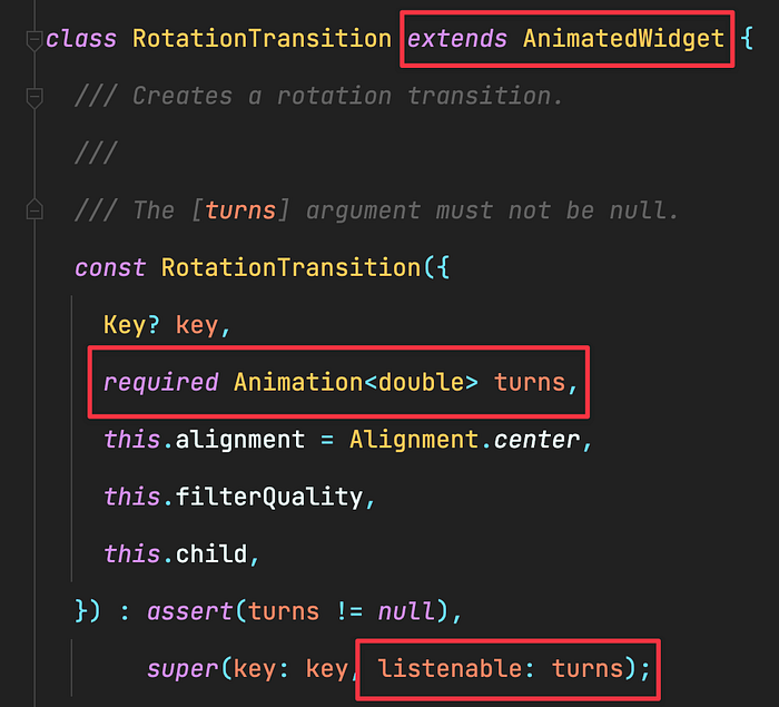
???? It extends an AnimatedWidget class, and from what we see, the Animation type parameter (in this case turns ) is passed as a listenable to the super class:
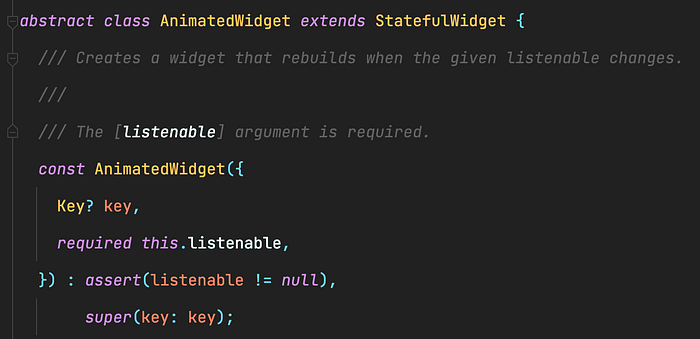
And the AnimatedWidget is basically a StatefulWidget! So we can do the exact same!
Let’s create our own GradientTransition widget then:
class GradientTransition extends AnimatedWidget {
  final Animation<double> stop;

  const GradientTransition({
    Key? key,
    required this.stop,
  }) : super(key: key, listenable: stop);

  @override
  Widget build(BuildContext context) {
    return Container(
      height: 100,
      decoration: BoxDecoration(
        gradient: LinearGradient(
          colors: const [purple, pink, yellow],
          stops: [0, stop.value, 1],
        ),
      ),
    );
  }
}And to use it, we simply pass it the AnimationController:GradientTransition(stop: _controller),